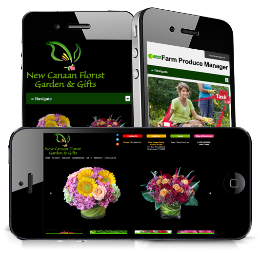
Responsive Web Design
Garden Center News websites are beautiful and colorful sites. Websites have dramatically changed since 2007. Mobile phones now account for over 70% of site visits. Store owners see shoppers standing over plants and looking them up on their phones right at the garden center. These sites that are built to appear beautifully on mobile devices as well as desktop or laptop computers are called Responsive Sites.
We began building sites optimized like this, and including thousand of pages of plant galleries, care instructions and seasonal articles. Customers are getting their information from the web. We want them to get it from your website. We want that relationship to be as strong as ever.
Responsive Web Design approach is aimed at crafting sites to provide an optimal viewing experience easy reading and a minimum of resizing, panning, and scrolling-across a wide range of devices (from mobile phones to desktop computer monitors).
A site designed this way adapts the layout to the viewing environment by using fluid, proportion-based grids, flexible images, and CSS3 media queries, an extension of the @media rule.
The fluid grid concept calls for page element sizing to be in relative units like percentages, rather than absolute units like pixels or points. Flexible images are also seized in relative units, so as to prevent them from displaying outside their containing element. Media queries allow the page to use different CSS style rules based on characteristics of the device the site is being displayed on, most commonly the width of the browser.

